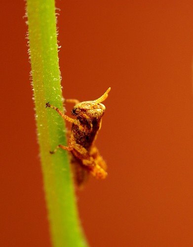
ThanksWhat do you guys think of the picture itself from a photographers point of view? I need some constructive criticism
Darn yeatzee, I wrote two paras of brilliant critique, went back to check yr age, and lost the post. I'll P.M. you tomorrow, but basically, this is a nice snapshot, which is all most folks want or can "see."
Briefly, the subject's head is right in the middle of the pic, and the image occupies the central 25% of the frame. It will be more interesting if it is in the bottom right corner looking up to the left with the stem almost (more interesting than exactly, in a nature shot) dividing the frame diagonally. If you place it in the lower third of the pic (good old "rule of thirds") you will emphasize how tiny and fragile the cric is by having it gaze into the huge world of the upper 2/3 of the frame. Also, nature photographers often talk about "leaving space on the frame for the animal to move into."
I think that using a "studio" rather than a "natural" background enhances the effect, but the background color is far too saturated, which deemphasises the main image, and is, in my opinion, the wrong color.
O.K. these are the main problems. I''ll talk to you about solutions and depth of field issues in the P.M., but you're off to a good start, and wanting to have your pix critiqued for composition is the right attitude if you want to improve.
The few points that I have made here are very basic, but I hope that some other members with training in composition rather than just macro technique (a totally different thing), critique it too.
Keep showing us pix!