Ha,ha, Tanner! i looked at the pic before reading your comment and thought, "he's really beginning to get the idea!"
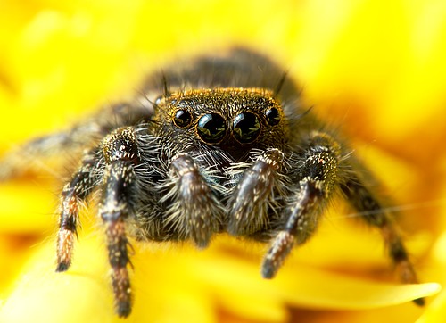
I think that this is great on a lot of levels. I like the central, "in yr face" position of the head, the effect of his orange "flat top" (is that a wig?) against the out-of-focus abdomen, and the soft, tightly cropped (!) petals. If it were my pic, I would be very happy with it as is, though I'd probably try to sharpen its left second leg to match the right one. I'd leave in the web line on the (our) right of the pic.
If you can find the time on Sunday, I would really like to see your 'shopped version.
Nice job!


